Progress bar
A progress bar allows you to focus the attention of the user with a visual clue on his progress in a particular journey.
Variations
Linear progress
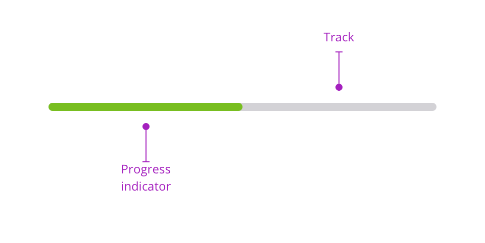
Linear progress embodies the idea of clearing a path. It can be used during long surveys to visually materialise the progress of the user in a particular journey. The linear progress bar is made of two distinctive elements:
- track: symbolised by a grey bar to demonstrate the path that still has to be made.
- progress: embodies the progress the user has made so far.
Default version
This version is the most accessible version of this pattern. We used $color-info-600 color to illustrate the informative goal of this progress bar. You can choose between two different sizes for this pattern. Smaller size is perfect for indicating a progress inside a table and medium size can be added in a stepper for long user journeys.
Branded version
Because Mozaic is mainly used in LEROY MERLIN context we also provide a color branded version of the progress bar but you have to keep in mind that this version is the least accessible and that it doesn't pass AA standards. See our dedicated accessibility page for more informations.
Percentage progress
The percentage progress bar version is used when you need to tell the exact progression the user has made. This version has the same track and progress elements with the percentage number centered.
Please note that you will have to change the font-color from G900 to G000 when the progress is more than 51%.